Rydoo
A special welcome
to French users


With its fun travel and expenses app, Rydoo’s mission is to ‘eliminate painful and frustrating processes for companies worldwide’. Mine was to eliminate pain points and inconsistencies for their French website visitors.
Tailoring the homepage
to the French market
Rydoo, a Sodexo Corp-Up, had recently redesigned and rewritten the English version of its homepage. They asked me to translate it into French and to adapt it to the French market.
Focusing on the
French user experience
Translating the content
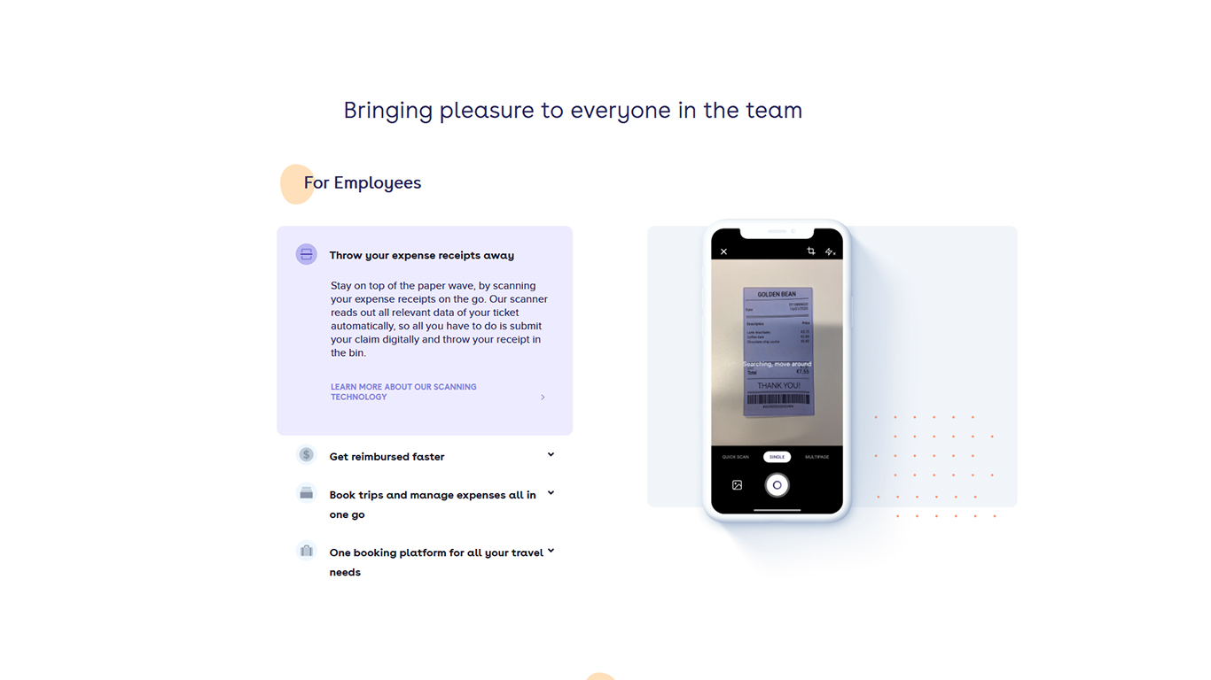
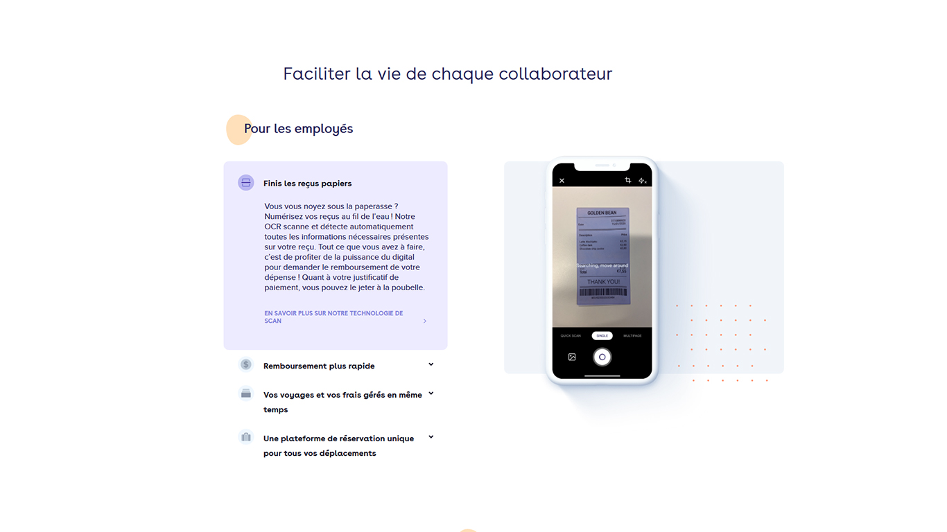
I translated the content from English to French, all the while keeping French connotations, cultural references and habits in mind.
English
French
For instance, using the French word for pleasure (plaisir) in this context would have sounded inappropriate for French readers. Given this, I recommended an alternative option which focused on making life easier (faciliter).
Improving the microcopy
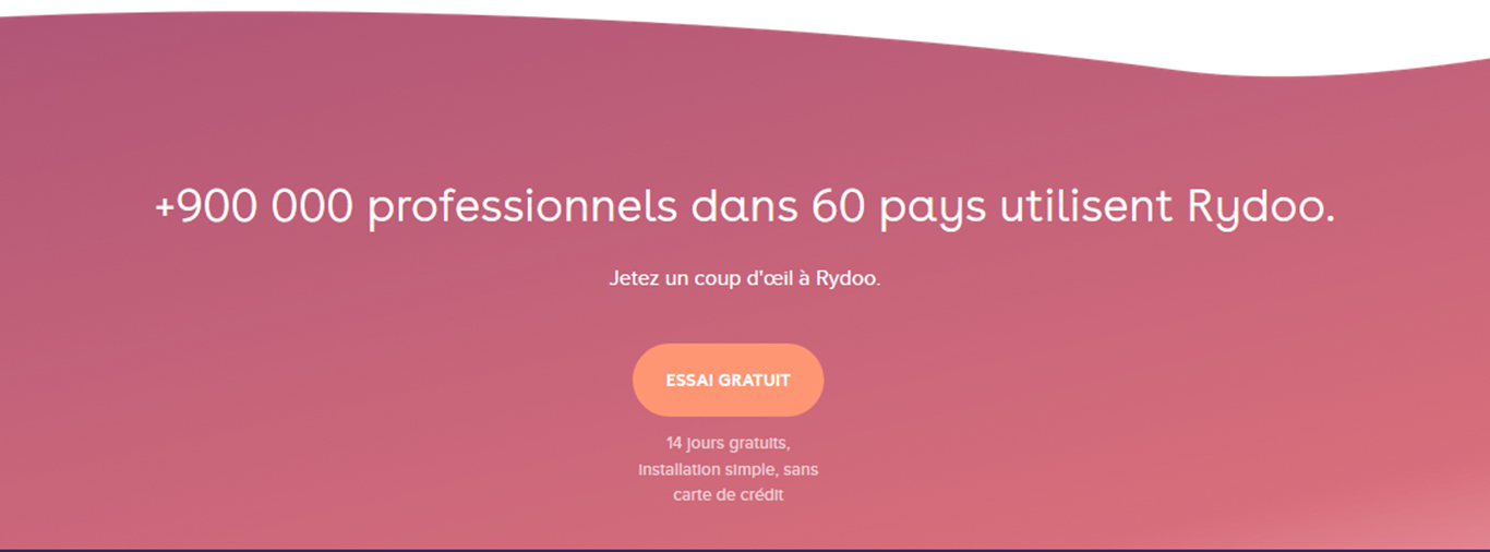
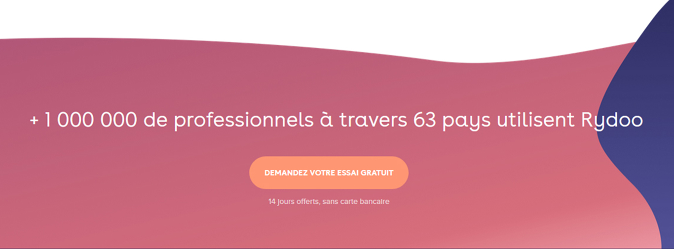
I applied UX best practice to improve the microcopy (tiny bits of text on the interface that guide users and trigger them to act).
Before
After
In this example, I provided wording that was both shorter and more commonly used than the previous French version.
Before
After
Here, I advised addressing the reader directly and being clearer about what would happen when the user clicked on the button, in line with call-to-action best practice.
Ensuring overall consistency
When translating and adapting a digital interface, I put myself in the shoes of a French user. I reproduce their journey so I can make sure it’s a seamless experience, every step of the way.
English
French
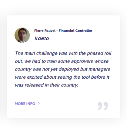
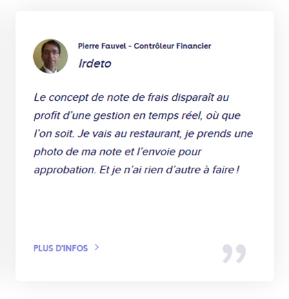
I noticed that the English version and the French version of the case study on the website were quite different. So rather than simply translating the English excerpt, I selected a relevant extract from the French case study to maintain consistency for the reader.


